Scattered journeys
People found events on Instagram, bought tickets on one site and messaged the venue separately for a table.
Venue Verse lets people in the US discover bars, clubs and events, buy passes or book a table with live availability, and walk in with a QR code. I led the design end to end — every decision, every client call and every screen — from a blank canvas to a live app.
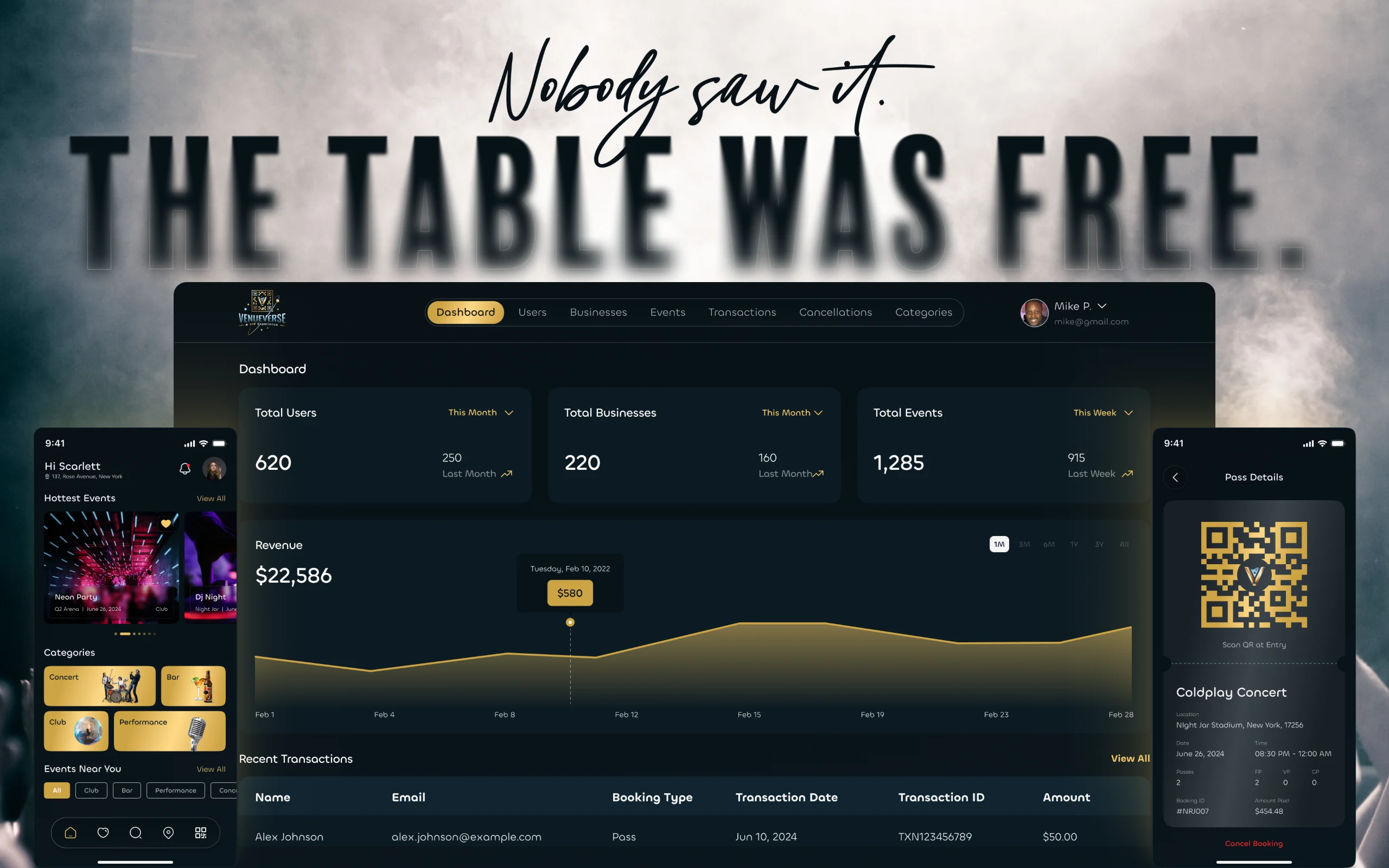
Venue Verse is a mobile app for nightlife in the US. People discover concerts, club nights, comedy and bars near them, buy a pass or reserve a table, pay in the app and check in at the door with a QR code. It’s live on the App Store and Google Play, published by VenueVerse LLC.
Mostly 21–35-year-olds planning a night out — often the same day — and groups booking a table for an occasion. On the other side are venues and organisers, who need their capacity, tables and events in front of the right people without managing bookings by DM.
Ticketing apps treated nightlife as a one-size-fits-all ticket. But a club night isn’t a concert: tables, time slots, VIP sections and group seating are what venues actually sell.
People found events on Instagram, bought tickets on one site and messaged the venue separately for a table.
There was no way to see whether a table was free or to get an instant confirmation — just DMs and hope.
Most platforms didn’t separate general entry from reserved tables, so people turned up expecting something they hadn’t booked.
Tables were managed by hand, which meant double bookings on busy nights and empty tables on quiet ones.
Events were pushed across many channels with no way to see what reached people or what turned into a booking.
Passes and tables share the same shape — discover, choose, pay, check in. One well-designed flow could serve every kind of venue.
Client sessions, conversations with nightlife-goers, social listening and a teardown of the leading ticketing and reservation apps.
Split the product into event passes and table reservations, set three design goals and prioritised features by impact against effort.
Paper sketches for the entry point, the booking type and table booking — two options each, compared on real night-out scenarios.
A dark, premium visual language, a shared booking system for passes and tables, and every state from sold out to cancelled.
Shipped on the App Store and Google Play, then a redesigned home with more featured events and filtering across 25 categories (v1.1.5, January 2025).
I wanted the emotional side as much as the practical one: why someone books a table instead of a pass, how they find events, and what makes them give up halfway through.
People decide to go out within hours of an event. If booking isn’t fast, the night is planned somewhere else.
Tables mean status, a better view, seating for the group and bottle service — they deserve their own flow, not a ticket with a seat number.
Nobody wants to switch apps or tabs to compare general entry with a table. Both had to live in one place.
For higher-priced bookings, people won’t pay in an app that looks dated or unclear. The design itself had to earn the money.
“I owned Venue Verse’s design from the first client call to launch on iOS and Android. I made the decisions, presented the work to stakeholders, took the feedback and turned it into the next version.”
The screens and states I designed for guests — and the admin side that keeps them accurate.
Guests sign in with Google, Apple or email, a one-time code and a 21+ age confirmation; business owners pick their role on the same screen.
A location-aware welcome, trending events in a carousel, categories and events near you.
Find events and venues by category, date and distance — across 25 categories.
A full-bleed hero, date, venue and price, what to expect, the main attractions, directions and a call button.
Several pass types — general, front of line, VIP — with quantities, sold-out states and a clear total.
Time-slot tiles, seating areas — indoor, outdoor or by floor — table types with capacity, and a waitlist when they’re gone.
A booking summary with the price, fees and taxes up front, then payment in the app.
Every booking’s QR code, date, time and booking ID — one tap from anywhere.
Upcoming, completed and cancelled bookings, easy to tell apart, with cancellation where allowed.
Saved venues and events, and what’s on close by tonight.
Place pages with contact details and upcoming events, plus reminders, VIP drops, pre-event tips and traffic alerts.
The heart of the product was a tension: event passes and table reservations are different purchases, but they’re made by the same person, often for the same night. Two separate flows would double what people had to learn. One forced, shared layout would serve neither well.
I sketched two entry points. In the first, people chose “pass” or “table” before they saw the event — quick, but they were choosing without context. In the second, the choice came after the event details, once they knew what the night offered.
The second won. Then I made the booking screen itself flexible: one “Buy” screen, with a booking-type selector that switches between passes and tables in place, so nobody has to go back to start.
Why this, not thatI didn’t ask people to pick a booking type up front. It saved a tap, but it pushed the most important decision before the information needed to make it.
Ticketing apps stop at a seat number. A table is different: it has a time, a place in the venue, a size and a price per table. And on a Friday night, tables go fast.
For time I tried a calendar picker and slot tiles. Tiles won — readable at a glance and quick to tap on a phone, at night, with one hand. Seating became an explicit choice — indoor, outdoor or a particular floor — because where you sit is part of what you’re paying for.
For availability, the rule was that the screen must never lie. Tables show live counts, a table is held the moment checkout starts so two people can’t pay for the same one, and a sold-out table offers a waitlist instead of a dead end.
Why this, not thatI chose slot tiles over a calendar. A calendar is more flexible, but nightlife runs on a few fixed slots — tiles made the common case fast instead of making every case possible.
Research kept coming back to trust. People would happily browse in any app, but for a $200 table they needed to feel the app was real, current and clear about what they were paying.
So trust became a design requirement, not a coat of paint. The visual identity is dark and premium, with gold accents that feel like the night itself. Every price shows its fees and taxes before payment. Every booking has a clear state.
And trust has to last until the door. The QR code is one tap from any booking — no digging through menus in a queue at midnight.
Why this, not thatI kept the price breakdown on the booking screen, not on a later checkout step. Showing fees earlier makes the total feel higher — but surprising people with them later costs more trust than it saves.
Live availability is only as good as the data behind it. Behind the guest app sit two web roles I designed: business owners, who create and run their events, and the Venue Verse team, who see the whole platform.
Business owners build every event in three steps — details, passes and tables — the exact options guests then see in the app. The super admin sees revenue, customers, businesses and every booking and cancellation across the platform.
Users, businesses and events this month, revenue over time and the latest transactions.
Every venue with its owner and contact details, an active or disabled switch, and a page with revenue and upcoming events.
Three steps — basic details, pass types with quantity and price, then tables with scheduling slots, locations and prices.
Mark an event as hot to feature it in “Hottest Events” on the guest home screen.
Manage the building blocks — pass types, tables, seating locations and attraction points.
Every guest and their bookings, every payment and every cancellation, searchable.
Passes and tables are different purchases for the same person. A shared system with a flexible booking screen let them feel related without forcing one layout on both.
If the screen shows a table that’s gone, the app has failed. Live counts and a checkout hold were designed in from the start, together with the developers.
People book late, on the move, with one hand. Big targets, slot tiles and fewer steps mattered more than extra options.
A dark, luxe look can easily hurt legibility. Contrast, type weight and clear states kept the mood without losing the content.
Heavy filters up front slowed people down. Rich visual discovery came first, with filtering one step away.
Loyalty tiers, group booking, in-app messaging and AI recommendations were all tempting. They went on the roadmap so the core booking could ship well.
Dark, warm and premium — built as a system so passes and tables share every component and future features slot straight in.
3 apps1 app (from 3 apps to 1 app)
Discovery, passes, tables and check-in in one place, instead of Instagram, a ticket site and a DM.
Source: shipped productDMsLive (from DMs to Live)
Table availability shown in real time, with a hold during checkout so two people can’t book the same table.
Source: shipped productBlindInformed (from Blind to Informed)
People choose a pass or a table after seeing the event, and can switch without starting again.
Source: shipped productLate feesUp front (from Late fees to Up front)
Every price shows its fees and taxes before payment.
Source: shipped productDMsWeb panel (from DMs to Web panel)
Venues create events, passes and tables themselves, and Venue Verse sees revenue, customers and cancellations — instead of messages and spreadsheets.
Source: shipped productBriefiOS & Android (from Brief to iOS & Android)
Live on the App Store and Google Play, then improved with a new home screen and filtering across 25 categories.
Source: App Store, v1.1.5 (January 2025)Moving one choice — pass or table — to after the event details changed the whole experience more than any screen polish.
Slot tiles beat a calendar because nightlife runs on a few fixed slots. Flexibility nobody needs is just friction.
The premium look earned the first tap; clear prices and booking states earned the payment.
The interface can only be as honest as the data behind it, so availability was designed with the developers, not handed to them.
Venue Verse is live on iOS and Android — see the app as it is today.
Built for the night.
From “what’s on?” to the door.
Venue Verse is live on the App Store and Google Play and still growing — with loyalty tiers, group booking and smarter recommendations on the roadmap the system was built to support.